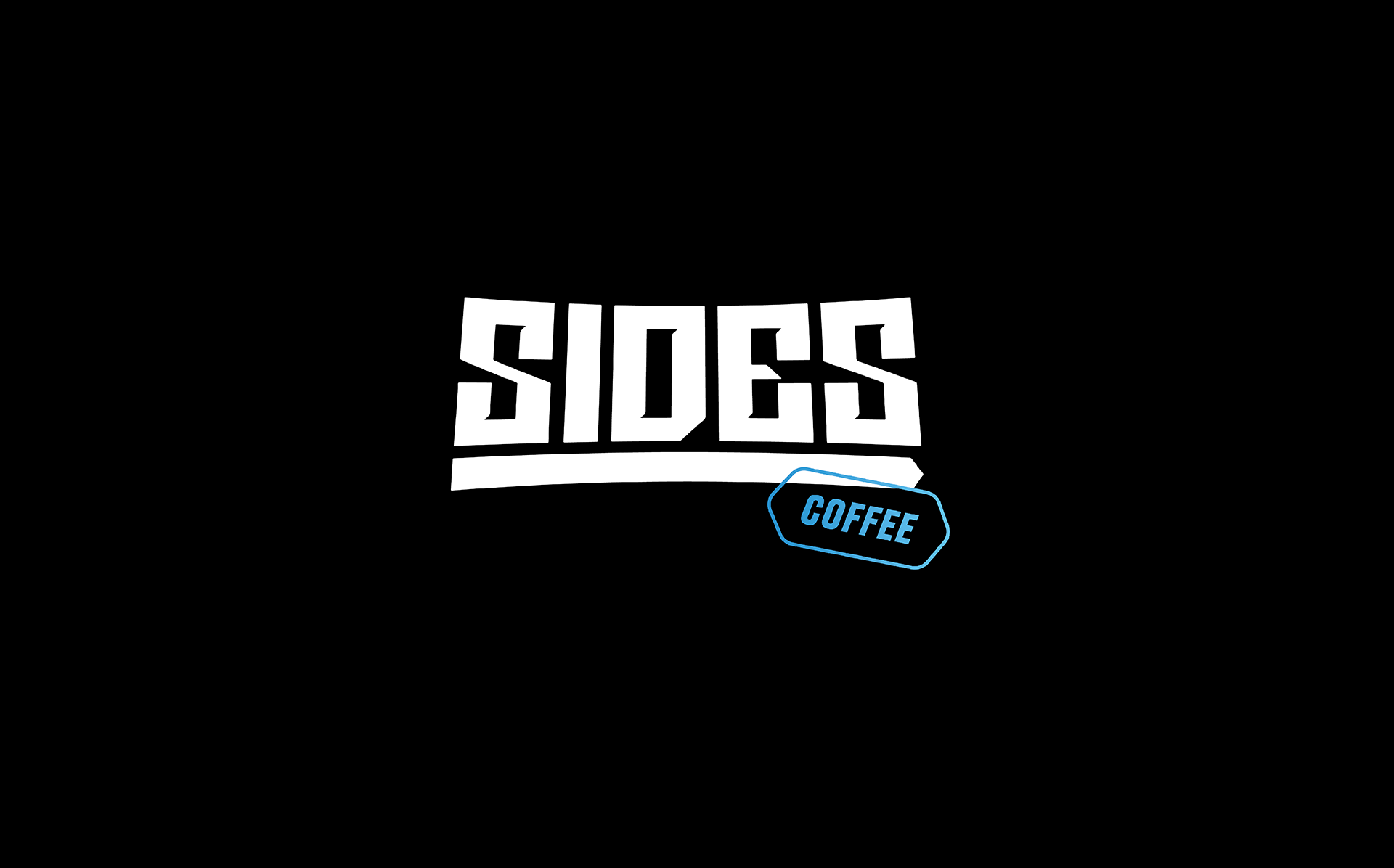
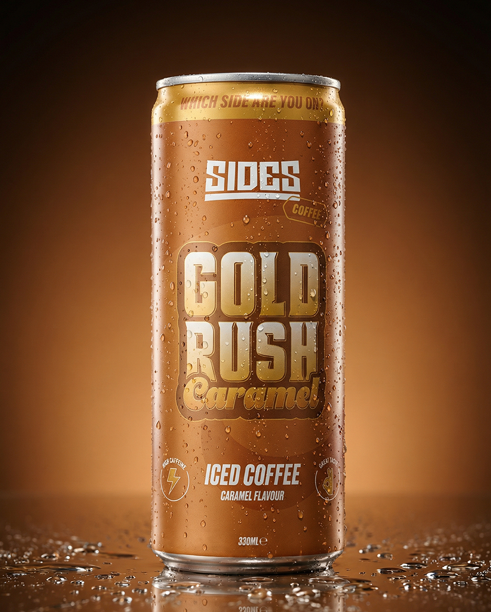
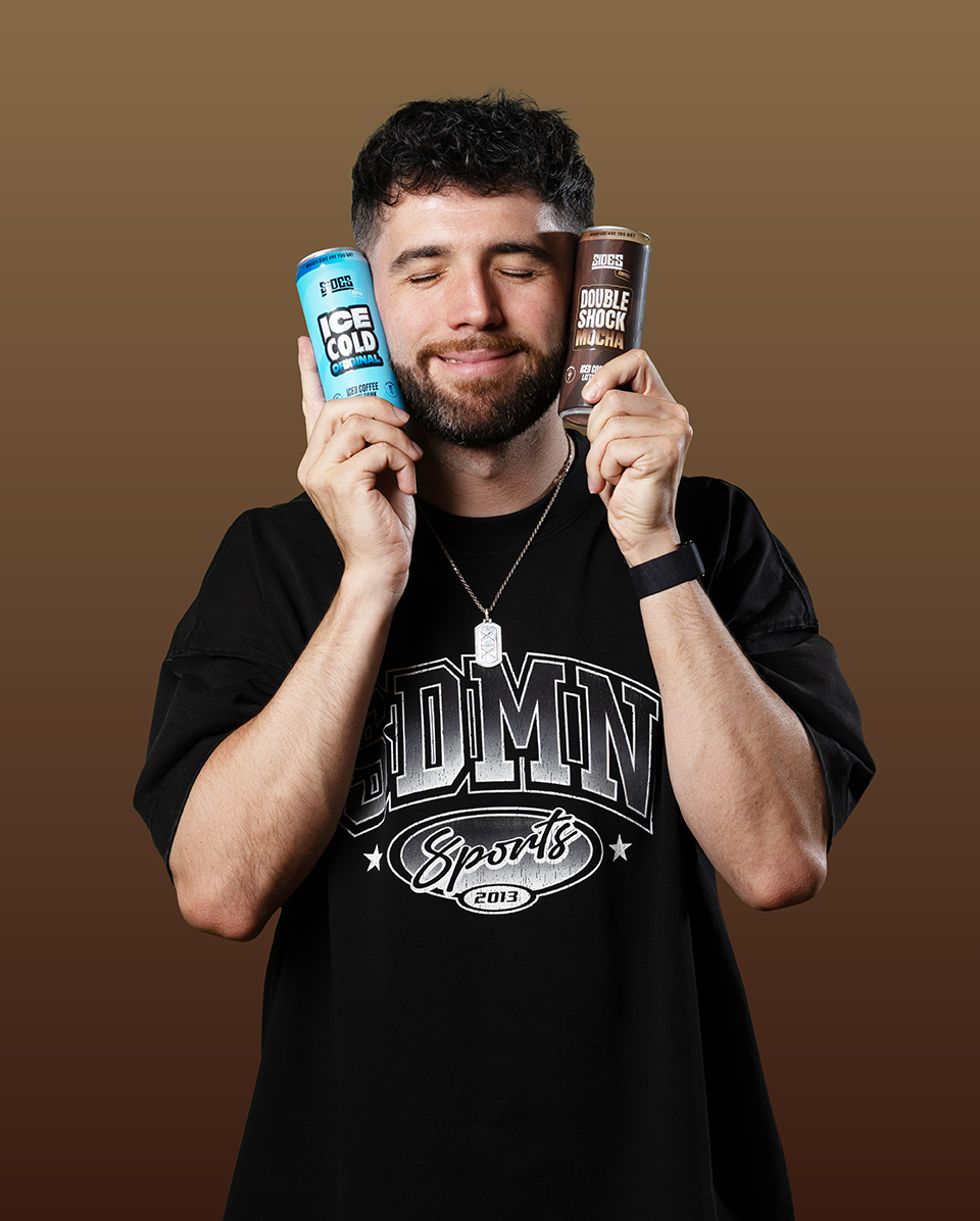
SIDES COFFEE:
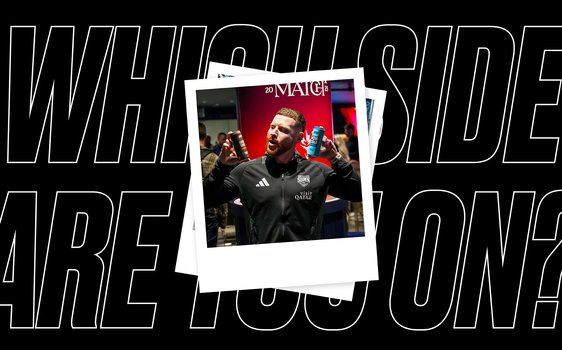
By the SIDEMEN
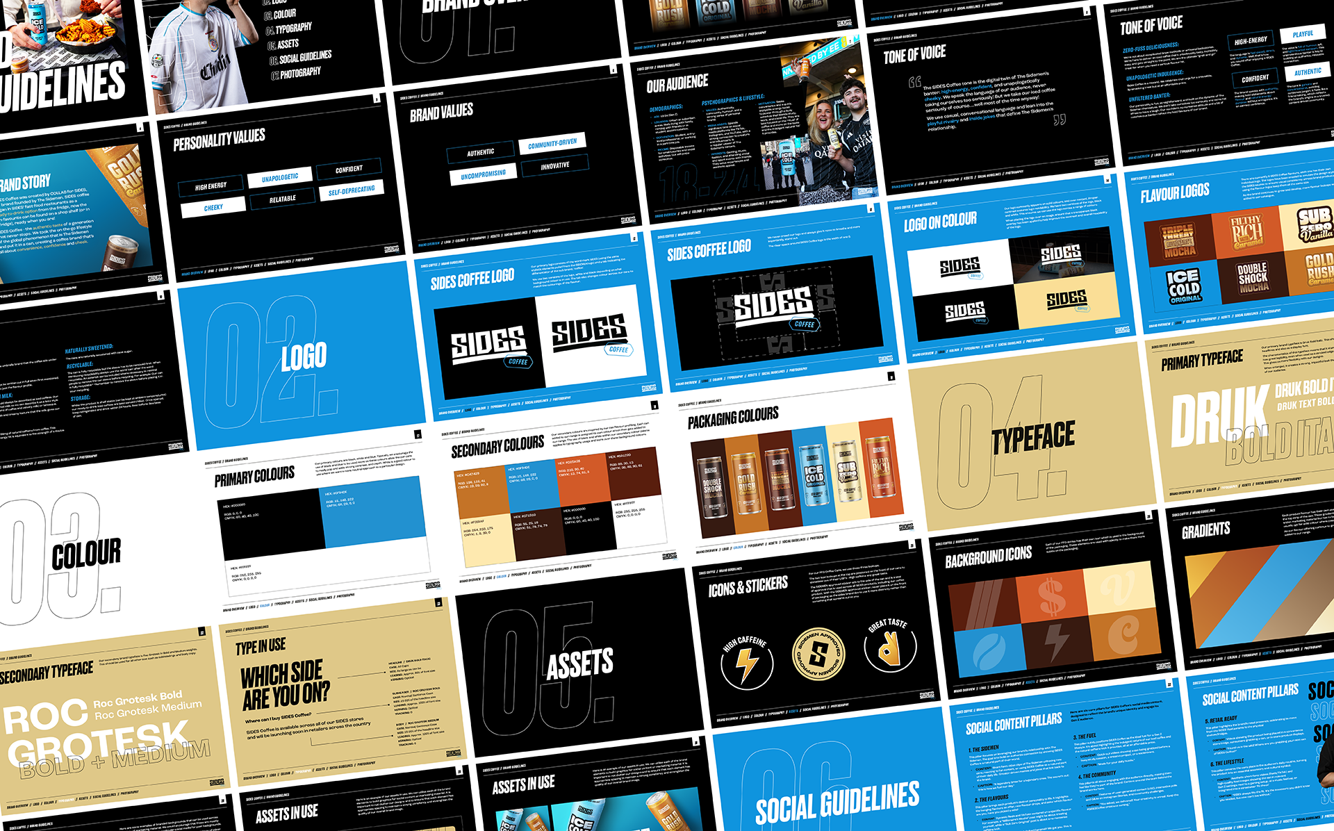
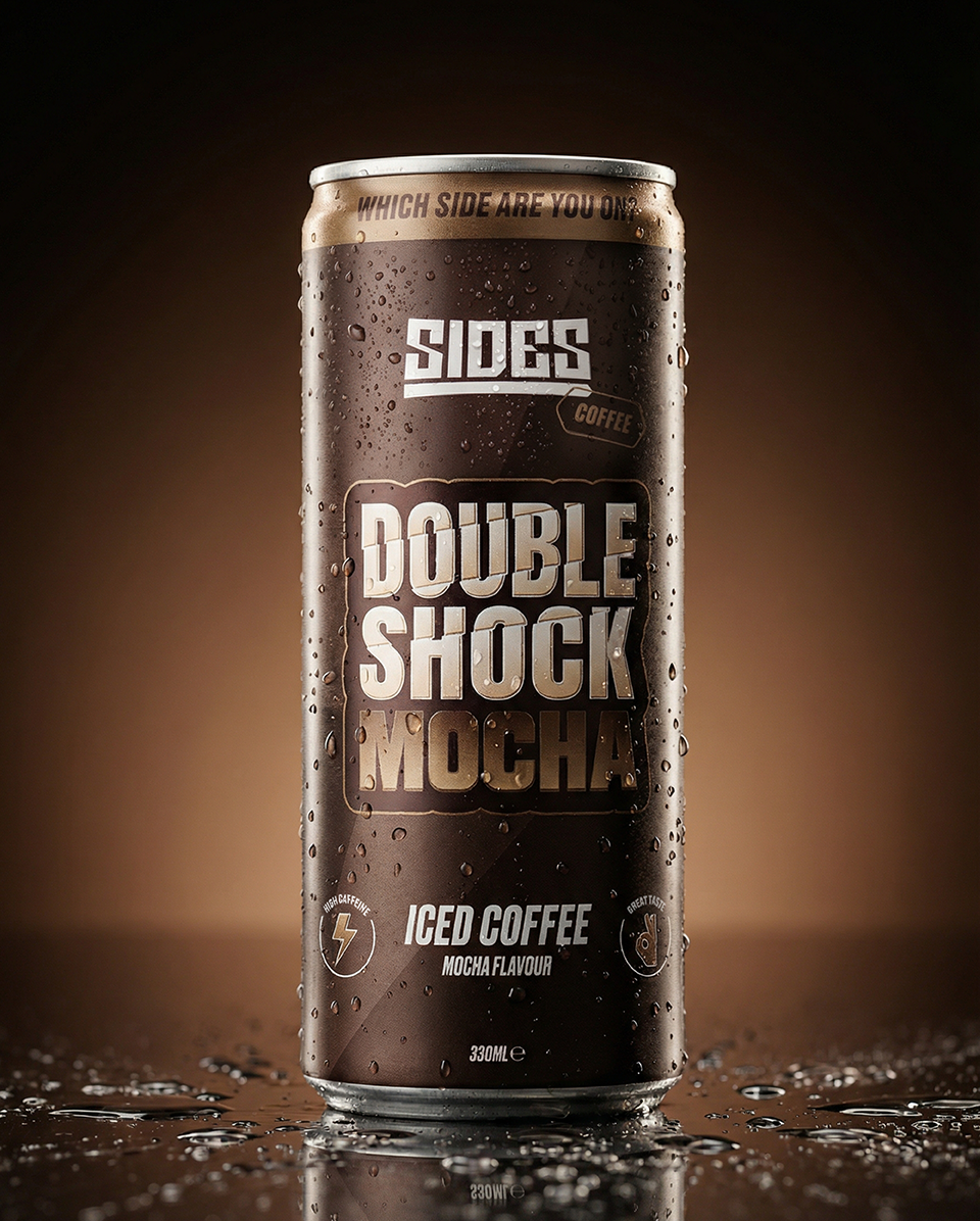
Sides Coffee is an extension of the existing EatSides brand, translating the bold and recognisable identity of the Sidemen’s fast food business into the ready-to-drink coffee space. Built from the foundations of the original Sides visual system, the project focused on evolving an established brand into a new category while maintaining the energy, personality and immediacy that made it successful in the first place.
The Sidemen have grown from one of the UK’s largest creator groups into a network of scalable consumer brands, with Sides becoming a significant part of that expansion. Known for its strong colour palette, confident typography and digital-first tone of voice, the brand already carried a clear identity within the fast food space. The challenge was adapting those assets for a retail coffee product without losing the recognisable character attached to the original brand.
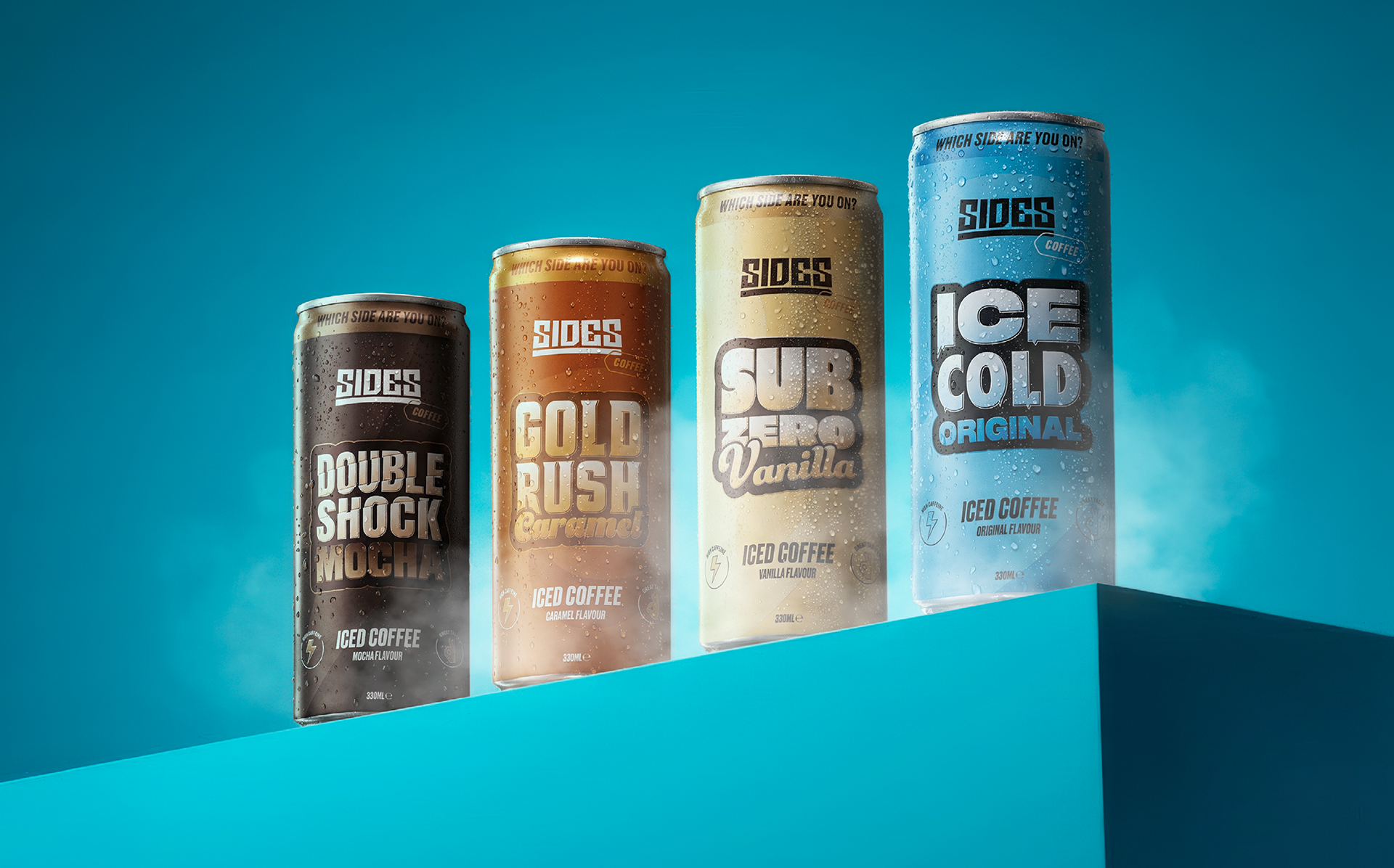
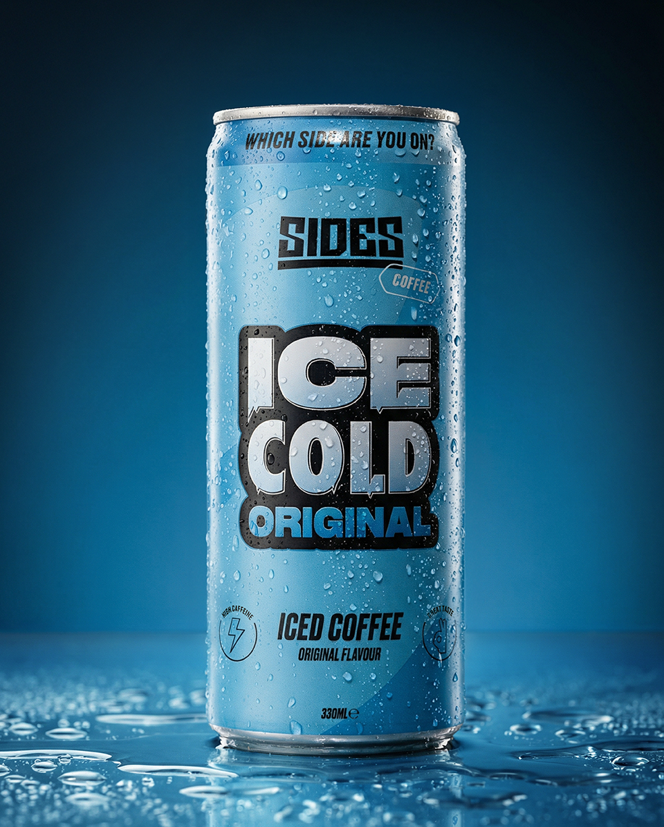
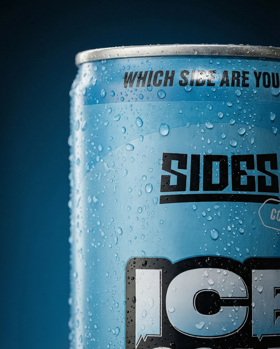
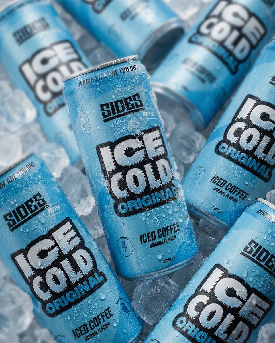
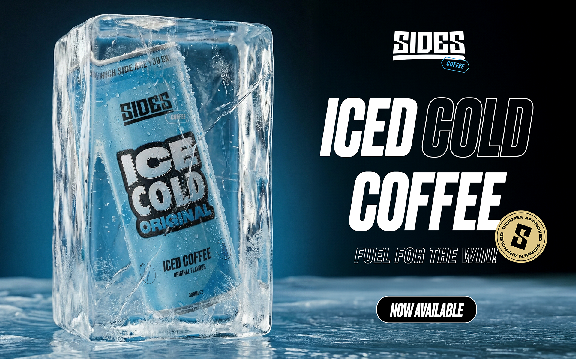
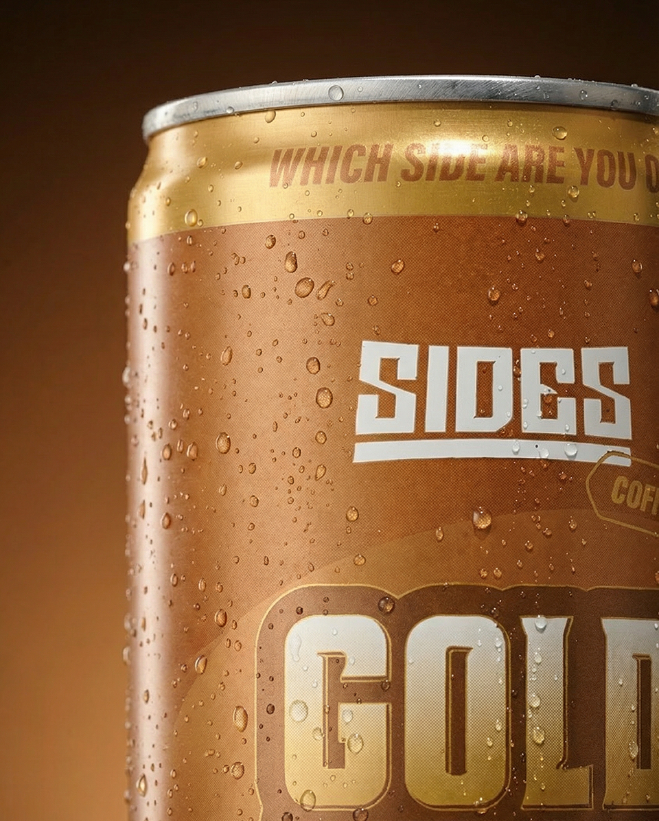
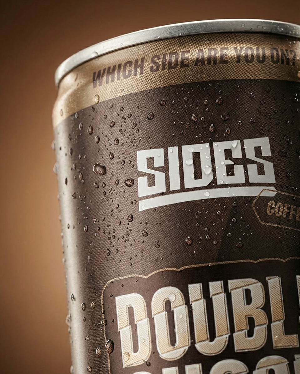
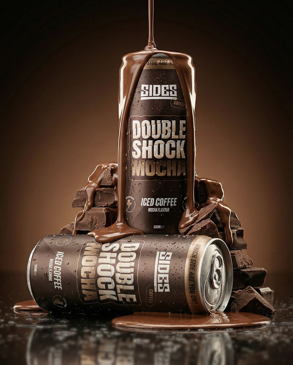
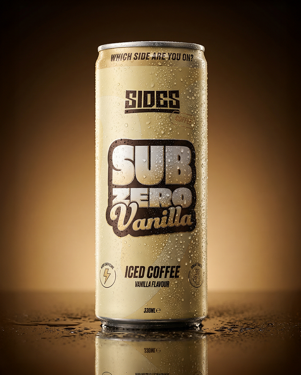
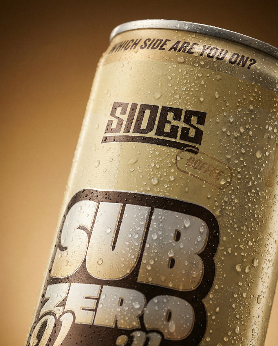
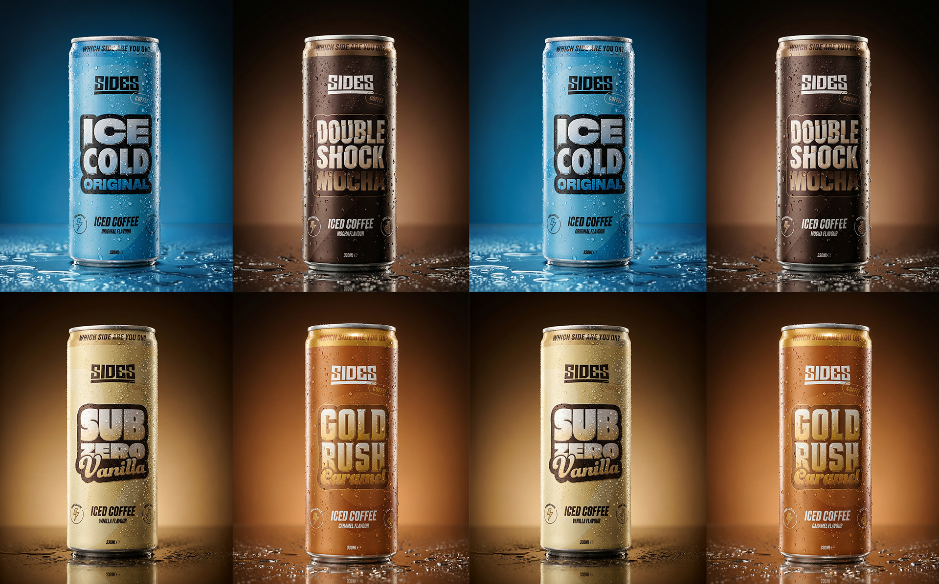
The creative approach focused on translating the visual confidence of Sides into a format that could compete on shelf. The system needed to feel immediate and familiar to an existing audience while functioning effectively within the iced coffee category. Packaging hierarchy, colour application and typography were refined to improve visibility and navigation across the range, while still retaining the boldness associated with the parent brand.
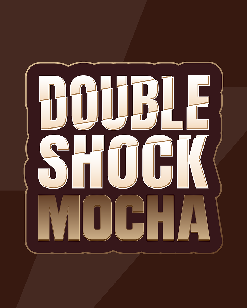
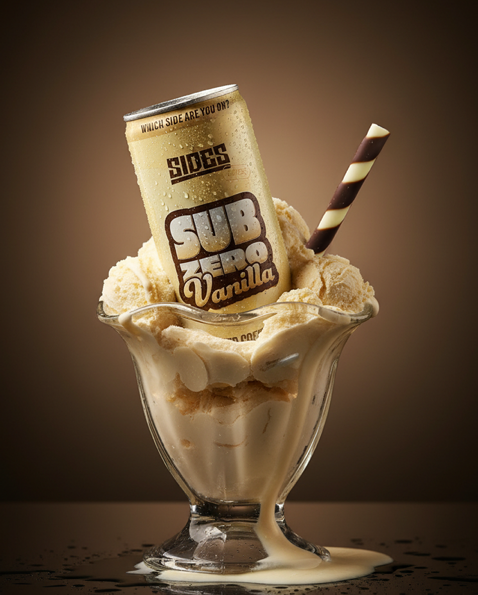
A flexible identity system was developed across four launch flavours — Original, Caramel, Mocha and Vanilla — allowing the range to work cohesively as a single product family while giving each variant its own distinct presence. The result balances consistency with individuality, ensuring the products remain instantly recognisable while adaptable across future applications and extensions.
The final outcome is a brand extension that successfully carries the Sides identity into a new market. Familiar in tone and visual language, but reworked with the clarity and flexibility needed for a competitive retail environment.