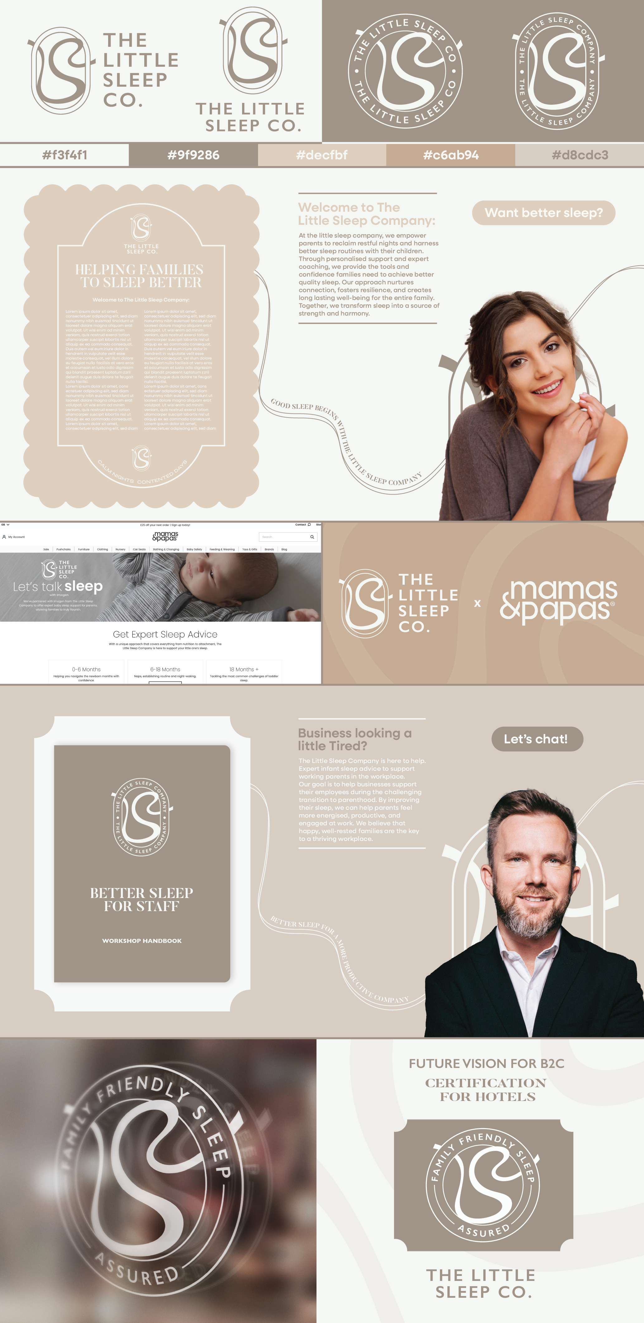
the Little sleep Company rebrand

2025

This year I took on a freelance project working with Imogen, Founder of The Little Sleep Company. The Little Sleep Company is a specialist family sleep consultancy & enterprise, providing workshops for enhanced child sleep. Working closely with private clients & corporate partnerships to change the way parents experience sleep.

Brief: To strengthen their position as a company which is here to stay, standing out alongside their big name partners and looking like the truly reputable & timeless company they are striving to be.

Brand Description: They value themselves on being compassionate, nurturing and aspirational. Their mission - challenging the outdated approaches to sleep by empowering families with accessible & evidence-based strategies that foster connection, confidence & wellbeing.

Brand objectives: To create a refreshed identity to allow The Little Sleep Company to have a more professional, impactful look and feel. The new identity will help to fuel future collaborations, driving new business and elevating the brand. The brand will need to stand out and compete alongside these partner brands.

Core values: Casual, Curated, Relaxing, Quality, Fun, Caring, Supportive.

Target Audience: The brand needs to appeal to a working parent (ideal customer specified as countryside, middle class vibes) as well as corporate. The audience cares about creating better relationships around sleep with their children and want to create stronger foundations to help improve this. They are caring and attentive for their children. Corporate wants to help support their workforce to ensure families are getting good, quality sleep.

Research and Ideation

I started by holding a kickoff meeting with Imogen to gain a clearer understanding of the goals behind the rebrand and to deepen my knowledge of her brand identity. During this meeting, I gathered key insights that informed the direction of my research. Following our discussion, I created a comprehensive research deck and developed this body of research to help influence, and guide the design ideation process. This foundation supported the development of initial concepts that aligned with Imogen’s vision and brand objectives, ensuring a focused and informed approach to the rebrand.

I presented three design ideas to Imogen, each carefully crafted to meet the criteria outlined for the rebrand. While the designs aligned well with the project requirements, Imogen expressed that she didn’t fully resonate with them and was interested in exploring additional concepts. She emphasised the importance of having a brand identity that feels curated and almost hand-made, aiming for an overall aesthetic that is calming and approachable. She also wanted to soften the colours further. Although she didn’t commit to any of the above designs, she appreciated elements from each concept and was eager to incorporate some those features into future iterations.

Second design ideations

I designed three distinct variants of brand identities, each thoughtfully incorporating key elements from the design direction that Imogen wanted to pursue. When these options were presented, the middle design clearly emerged as the favourite and was subsequently chosen for further development. The concept behind this particular option draws inspiration from a unique sleep therapy technique that Imogen uses in her practice, which involves the use of a flowing ribbon which is tied to a door and then handed to the infant to help with connection. This ribbon over time is shortened by the parent until the child is comfortable to sleep without it, thus improving their sleeping routines. This ribbon shape gracefully weaves through the form of a baby cot, symbolising her dedicated work with young children, while at the same time subtly forming the letters "LSC," representing the letters in the brand name, The Little Sleep Company. These carefully crafted and nuanced design details resonated strongly with Imogen, ultimately becoming the essential foundation upon which the final design was evolved and refined.

Previous
Previous

Personal Branding

Next
Next

UK road signs: Silent Beauty